

Review by Joel Friedlander, TheBookDesigner.com

Click to enlarge
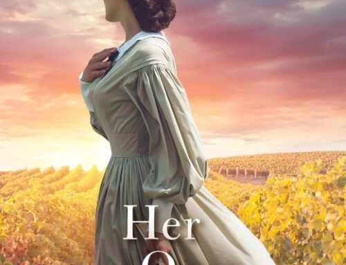
Our next book for review is Stay by Moriah Jovan. (6″ x 9″, 332 pages, softbound, ISBN 978-0981769639, B10 Mediaworx.) This is the second book in a series titled “The Tales of Dunham.”
Design Review—Cover
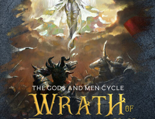
All of Moriah’s design for this book is careful and elegant, and the tone is set by the cover. Stay is a “contemporary romance with a hint of suspense,” according to one reviewer. Here’s where I think this cover is pretty effective:
- Moriah has shown useful restraint in keeping the number of elements to a minimum. This allows the elegant script typography of the title to really stand out
- With its limited palette of colors, the designer is able to convey something of the passion and the mood of the novel
- The entwined hands form a strong visual motif that does seem to also express the mood of the story of love and fate
- The mood, the hands, the typography and the general feel position the book well as a romance
- The background image of a black and white rendering of a watercolor provides interest while not overpowering the other elements. It also implies parts of the story we might learn.
Overall, this is a very adept design job for a non-professional. However, there are areas in which it might have been even better.
- The “Photoshopping” or manipulation of both the title type and the author’s name really seems excessive. Some of these “effects” offered by Photoshop and other image-manipulation programs can be used in moderation. Here, it looks like the type for the title might even have been drawn, but the three-dimensional modeling creates an unpleasant artificiality
- I’m not sure that Moriah hasn’t limited her palette a bit too much. The cover is essentially black, white and gray with pink. The story is actually quite colorful
- This also makes the cover look quite somber to me. The heavy shadows and dark tones in the background throw a dark mood over the whole cover, not entirely rescued by the image of the hands.
Design Review—Interior
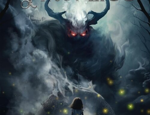
Here’s a spread from the interior of the book:

Click to enlarge
Right away you can see the care and attention to detail Moriah has exercised in this interior. As on the cover, she has limited her palette, here to two typefaces: the script from the title, and Adobe Jenson Pro. Here’s what I like about this interior:
- Adobe Jenson Pro, one of the best interpretations of the Renaissance type of Nicholas Jenson of Venice, a contemporary of Aldus Manutius, is a superb book typeface and adds its own elegance to the page
- Keeping the page simple pays big dividends since both the text and decorative typefaces have plenty of color and interest of their own
- The generous margins at the top and bottom contribute to the roomy feel of the page
- The script capitals make dramatic drop caps at the beginning of each chapter, adding a nice dramatic touch to those pages.
You can tell that Moriah put a lot of thought and attention into this design. I’m not sure I would have made all the same choices, though. Here’s where I had trouble with this design, both as a reader and as a designer:
- Similar to many other self-published books I’ve looked at recently, Stay seems to scrimp on the left and right margins. I know several self-publishers have said they do this specifically to save on pages, since each page saved decreases the wholesale cost of the book. In this case, roomier margins would have suited the overall design and made the book more enjoyable to hold, and to read.
- Although restrained as far as the number of typefaces, I quickly got fatigued by the amount of script used. The running heads align at the gutter (middle of the book spread) with the page numbers at the margins. Over three hundred pages of this script occupying the top of the page was a lot for me. Since the same script is used for chapter numbers, chapter titles, running heads, drop caps and folios, I think Moriah lost some of the impact of this lovely typeface through overuse. As a display face, it’s intended for larger sizes, like the chapter titles.
- I picked the spread above to demonstrate another difficulty with the large, 4-line drop caps. By choosing this typeface, a problem was created by the huge amount of white space created by some of the letter forms, like this capital “V.” When I look at this page, I see the large white “square” created by the space needed for the “V.” With a little more work it would have been possible to fit the lines of type to the shape of the letter, eliminating the distracting white space. Alternatively, a smaller size or different font could have been used.
- Although you can’t see it in this spread, there’s one other typographic element Moriah used here. Whenever there is a sign, a handwritten note, a memo, an email, or anything else that’s directly quoted, she used a script, or handwriting, or san serif typeface to represent the change. Sometimes these are separate, sometimes they occur in the same line as the rest of the text. While not that unusual, my problem with the solution Mariah used is the sheer number of typefaces. I counted about 10 different typefaces used for these elements, and that is just too many for me. Another solution would have been to pick one or two and stick with them. The appearance of different typefaces has to be weighed pretty carefully by the designer, because each is a shock to the reader, interrupting their flow, and has to justify itself. I think 10 different one might be a bit much. In reality, they are more of a distraction than an aid.
All in all, Stay is an accomplished and elegant design from a self-publisher. It suits the book well and demonstrates the author’s attention to detail and shrewd selection of typefaces. A nice job all around. I want to thank Moriah for sending this in.
If you’re interested in getting a design review for your book, add a request in the forum Submit Your Book for a Design Review and I’ll contact you with details.
 Joel Friedlander is the proprietor of Marin Bookworks, a publishing services company in San Rafael, California that has launched many self-publishers. Joel is a book designer and self-published author, and blogs about publishing and book design at TheBookDesigner.com.
Get an Editorial Review | Get Amazon Sales & Reviews | Get Edited | Publish Your Book | Enter the SPR Book Awards | Other Marketing Services


Thanks for the great review, Joel!
I actually had planned for wider margins, but accidentally locked myself into a page count and had to squish where I had not wanted to squish.
I’ll explain the use of the fonts (the to-do list, the emails, the handwritten notes), and I think it may just be a matter of reading style. I LOVE those design breaks in books. It gives my eyes a break from the solid text and pulls me closer to the characters and the circumstances. So I did it because I really like it when it’s done in other books.
And wow, thank you again for the great review!
I guess I guessed right on the page count. It was obvious you were enjoying yourself with all the handwriting fonts, because it came across as playful. Glad you enjoyed it, I thought the book was charming.