

Review by Joel Friedlander, TheBookDesigner.com

Click to enlarge
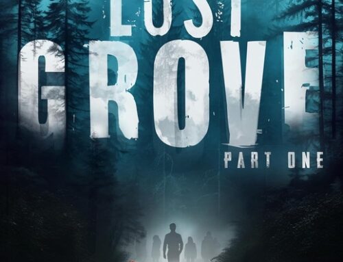
Our next book for review is the historical novel The Fiddler’s Gun by A.S. Peterson. (6″ x 9″, 293 pages, softbound, ISBN 978-0615325422, Rabbit Room Press.)
Design Review—Cover
This novel is set during the American revolutionary war. Arthur Peterson said in his email to me that
I have not been impressed with the quality of POD printing and decided to go with offset in part because the design of the book cried out for rough-edged (deckled) pages and a matte laminate cover.
The cover for Fiddler’s Gun shows the amount of work Arthur has put into this book. Here’s what works well for me on this cover:
- The matte lamination is very effective, giving the cover a soft sophistication it would lack with the typical high-gloss lamination we see so much of today.
- Overall the typography is handled with sensitivity, and the placement of elements works well.
- I really like the depth Arthur and his illustrator have achieved by layering and compositing different pieces of artwork in Photoshop. You can see that they intentionally controlled the dark and light areas of the illustration to show the type to best advantage, and the design creates a really atmospheric quality to the cover, inviting the reader into the story.
This cover doesn’t come off as an amateur, or haphazardly self-published book. Where this cover doesn’t work as well:
- Principally in the title. Rather than use typography, the author has chosen to integrate the title with the illustration by using a hand-drawn title, replete with lots of period ornamentation. Although I admire the skill with which this was done, it does not compare well to either the rest of the cover, or with other covers that use this same approach, but where highly skilled hand lettering artists have been employed. The net effect of this choice seems to me the only element of this cover—indeed, of the whole book—that looks amateurish.
- The design of the title has also been used to establish a strong vertical emphasis on the cover. Note the very long “L” in “Fiddler’s” and the ornaments that go along with this. I see no particular purpose to this emphasis, and it seems to involve us in a design idea irrelevant to the title or the illustration.
- Although the drawing is effective, the overall effect of the cover with the matte lam, the muted tones of the background, and the rustic dark red type of the title seems unnecessarily flat. All these elements combine to rob the cover of some of the drama it might have otherwise have had.
Here’s a photo that shows the effect of using “deckle-edged” paper, a nice touch that readers will enjoy and that harks back to the book’s historical era:

Click to enlarge
As you can see, this technique also requires that the fore-edge of the cover be slightly narrower than the full width of the book, because it cannot be trimmed along its face. A nice effect anyway, and a bit of luxury compared to most self-published books.
Design Review—Interior
Here is a typical spread from the book:

Click to enlarge
Here again, Arthur has created a beautiful typographic container for his novel. Because the book is long—100,000 words by the author’s count—he faced the challenge of finding an efficient typeface and layout to bring the book in at a reasonable length while maintaining readability. I think he’s succeeded on both counts. Here’s where I think this interior works well:
- The chapter openings use a decorative typeface for the chapter numbers and 3-line drop caps that expresses the historical period quite well.
- Following the drop cap, the author has emphasized the beginning of the chapter by running the first 4 words in small caps, an effective device that helps “dress up” the chapter opening nicely. This same small cap run-in is used at the text breaks, but without the drop cap.
- The centered running heads and folios add to the unobtrusiveness of the design. Very small and tasteful ornaments have been used around the folios to good effect.
- Although the type size of the Garamond text is small to accommodate the length of the book, extra space has been used in the leading—space between the lines—to keep it readable, a good decision.
This book is elegantly designed and easy to read and, in truth, there are few changes I would make to it to improve the interior design. Here are a couple of notes:
- You’ll notice on the spread above, at the bottom of page 200 (note that this image was taken from a PDF the author used for reviewers, and is not the same pagination as the printed book, in which this page—rightly—is number 201) there’s a widow, that is, the first line of a paragraph that’s been left by itself at the bottom of the page. This is a decision every book designer has to make when laying out books. The alternative would have left a larger space at the bottom of some pages than others. There are occasionally orphans as well—the last line of a paragraph at the top of a page by itself. By making this decision, every page can be made to have the same number of lines, and be perfectly squared-up. I don’t see this as a defect, but as a choice with unfortunate ramifications no matter which option you choose. The only way to avoid these widows and orphans completely is the rather unrealistic practice of rewriting selected sentences or paragraphs to get rid of the extra line, or some advanced typographic legerdemain to achieve the same thing by fooling the eye of the reader.
- With a lengthy book like The Fiddler’s Gun, the inside margin—or gutter—becomes particularly important. Although these pages look good, I think I would have added more space to the inner margin to account for the thickness of the binding, and sacrificed a bit of the outside margin. Again, this is a judgment call, and not necessarily a defect.
The Fiddler’s Gun is clearly a cut above most self-published book designs. From the great care in the typography to the special effects achievable only through offset printing, to the quiet readability of the pages, the author has succeeded in creating a beautiful vehicle for his novel, one that can stand beside most any book from any source. A different approach to the title would have made this near perfect. A beautiful job, and I want to thank Arthur for sending this in, and for his patience in waiting for me to find the time to do the review.
If you’re interested in getting a design review for your book, add a request in the forum Submit Your Book for a Design Review and I’ll contact you with details.
 Joel Friedlander is the proprietor of Marin Bookworks, a publishing services company in San Rafael, California that has launched many self-publishers. Joel is a book designer, a self-published author, and blogs about publishing and book design at TheBookDesigner.com.
Get an Editorial Review | Get Amazon Sales & Reviews | Get Edited | Publish Your Book | Enter the SPR Book Awards | Other Marketing Services


I’m glad you got a look at this one. I got it a couple of weeks ago and it’s THE best self-published book I’ve ever seen. He’s mentioned how LSI books pale next to it, and he’s right. The quality of the paper and cover are on a whole other level. I’m curious, however, about cost. Regardless of the crowdsourcing model which paid for it, I have to imagine it was a lot more expensive than your typical LSI package.
Henry, the unit cost in this case would be directly related to the quantity the author printed, unlike digital, where one book costs the same as 100. I would not assume this book cost more than at LSI, the only extra cost would have been for the “deckle” paper. Other than that, I would bet it was LESS expensive than LSI. And you definitely cannot get this quality from digital. Of course, you have to sink a few thousand $$ and warehouse the books–that’s the downside.
For example, my book Body Types, at 240 pages costs $4.02 at LSI, but when I last printed it offset, it was about $2.30.
Joel,
Thanks for the critique. I agree that the quality of the lettering on the title didn’t come out quite as well as I’d have liked. The best solution would have been to recreate it in Illustrator to keep the resolution high, the edges sharp, and the fill consistent but I simply ran out of time and money. I originally intended for the title text to be either embossed or spot-glossed which, I think, would have alleviated some of the issue you mention but once again–time and money.
Trying to get rid of widows and orphans is like playing whack-a-mole. Fix one and another pops up three pages later. It can be a real nightmare. I think I managed to clear out the biggest offenders, though.
I’ll be happy to answer some of those price questions. Deckled pages were free and I think I had to pay an extra 2 or 3 cents per copy to have the cover trimmed flush with the pages (other wise it would have had an overhang). The embossing and spot glossing was going to be about 15-20 cents extra, if I recall correctly.
The entire print run of 1500 cost me about $3500 which works out to about $2.35 per copy (that includes set up, shipping, and the whole shebang). Because I spent a lot of time pre-selling the book, I was able to write that check without dipping into my own finances.
The result is that once the books arrived and I had shipped out my pre-sales, I had about 1000 books left that I can sell for 100% profit. That’s important for a lot of reasons. It means I can give books away to reviewers and it doesn’t cost me anything. It means I can offer special bulk pricing to book clubs, schools, and libraries and it doesn’t affect my bottom line. It means I’m free to use those remaining books as I see fit and I’m not chained to a slim profit margin.
It also means that I can distribute them via Amazon for a competitive price and still make decent money. I’ve also acquired wholesaler distribution through Ingram to make it available to bookstores nation-wide.
Oh, and another nice thing about off-set printing is that a second printing of the exact same book is considerably even cheaper. If I did an exact 2nd reprint I think the books would be under $2 per copy. Sadly, I’ve found enough typos that the 2nd printing will have to be a ‘new’ book as far as the printer is concerned. That’s a real motivation to make sure you clean those pesky typos out before final press.
Thanks for the review. Happy to answer any other questions.
Another item I’d mention is that anytime I talk to folks about off-set printing, the issue of warehousing comes up. I’m not sure where that idea comes from. No self-publisher is going to print 20,000 copies and require special storage for their books. My print run was 1500 and that’s not even a full pallet. They easily fit in a spare closet.
One other thing 🙂
I wanted the composition and flourishes of the title lettering to hint at the shape of a fiddle. I’m really happy with the way it turned out.
Oh Joel, thank you so much for discussing windows and orphans. I agree, and I wish more authors would understand that it is not a defect to have them but a layout decision, no matter what Chicago says. I too like a squared-up text block. I think it looks better when every page ends on the same line, so I do not worry about windows at all, and the only time I worry about orphans is if the orphan is less than 3/4 of the line. In that case, I will go back in an either adjust the character spacing or I will re-write the line. I think all too often authors needlessly worry themselves over this stuff to the point that they make themselves insane. You can spend countless hours manipulating the white space and the paragraphing to eliminate windows and orphans, but the sad fact is, most readers have no idea what they are anyway. Hyphenation across a page break is another insidious time killer. Somethings can’t be helped and the time you waste adjusting might be better spent editing.
Pete,
Thanks for your additional input, which is really valuable. I agree that rendering the title in Illustrator and then embossing and foiling it would have made a big difference. And your prices are pretty much right in line with my response to Henry, above. You got a great price considering the size of your print run. The 1000 “pure profit” books are the sweetest part of the deal. I’ve often tried to convince authors to “pre-sell” their books for exactly this reason. For some books, an autographed copy and “first edition” status is all that’s needed if you have a supportive community. It doesn’t hurt that your book is excellent.
I usually advise offset-printing clients to get their books shrink wrapped in 3s or 5s, and you might consider that. It’s a little more money, but after the initial sales, when you might be holding the books for months before sale, you will know that they are still pristine when they come out of the cartons.
Cheryl,
Widows and orphans, hyphenation, and “rivers” in the page are what bedevil typesetters. For most books I prefer to kill the widows and orphans (sounds cruel, doesn’t it?) and have the odd page with an extra space at the bottom. Other books, where there is a rationale to do so, I slave over every page, trying to get them as close to “perfection” as possible. Some proofreaders and editors will also require policing of these areas before they sign off. I was trying to point out that these are decisions you need to make on a book-by-book basis. Thanks!
Joel,
Great post and great comments by everyone. I can identify with this issue – I had professor who was a real stickler for widows, orphans and rivers and, because of that, their existence definitely bugs me when typesetting. But Cheryl had a great point when saying that the time spent fixing these (relatively minute) issues could be better spent editing. For authors who typeset their own work I agree that unless it’s a severe widow/orphan (such as one word), their time could be better spent making sure the book is as perfect as possible, perhaps to receive that discount on their second run. If you’re hiring someone to do the work for you, however, then that may be a opportunity to be a bit more of a perfectionist.
Duolit,
I absolutely agree with Cheryl also. Your primary responsibility to your book is as a writer, and it will succeed based on the content, not the widows and orphans. I see them as additive, but it’s interesting being a writer and a book designer, because I’ve done a better job on the books I do for clients. Book designer irony.
Thanks.
I’m already struggling against my desire to buy this book, and I don’t even know what it’s about! It really does have that “special something” that would have me uncontrollably grabbing it off the table in the bookstore, or immediately clicking on it over at Amazon. It’s probably the best looking SP book I’ve ever seen. Some nice cover copy and a strong first page and I’d be sold on it. Well done, Arthur!