

Review by Joel Friedlander, TheBookDesigner.com

Click to enlarge
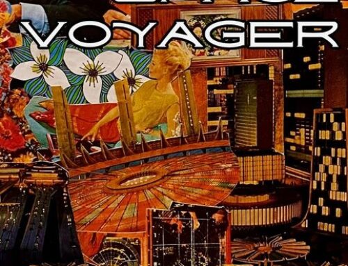
Our next book for review is a book of short stories, Stories from the Asphalt by John Sparger 5.5″ x 8.5″ 208 pages, softbound, ISBN 978-0979865008, Publisher: Unabashed Media, 2008.
In his email, John informed me that the book was printed by Lightning Source. The cover artwork is by Baron von Lind, the cover design by Erich Russek, and the interior artwork by Aaron Allen. John designed and produced the interior using Adobe InDesign.
Here’s what he has to say about Stories from the Asphalt:
Through an interconnected collage of short stories, flash fiction, poetry and artwork, readers take a motorcycle road trip across the country and into the lives of saints, dealers, junkies and whores; abandoned and lost souls looking for something, anything to fill the void along the pursuit of happiness in the underbelly of the American Dream.
Design Review—Cover
Stories from the Asphalt has one of the most interesting covers I’ve seen on a self-published book. The author has tried to place his book in the visual tradition of pulp fiction, but brought up to date. I think it succeeds brilliantly. Here’s what works for me:
- There is no denying the sexy and trashy allure of this cover. The illustration that’s been incorporated into the cover (Baron von Lind’s 1998 pinup “Daisy Mae”) immediately reminded me of those done by Alberto Vargas most famously for Playboy magazine. It really draws you in.
- The illustration is well integrated with the rest of the cover. It ties in with the “Asphalt” theme of the book, and the title is set in one of my favorite “grunge” fonts, Cracked. right away we know this book is going to be a potent blend of women, cars, and the life of the road.
- Although I don’t often like covers with black backgrounds, this one works. The background throws the yellow type, and most especially the charmingly unclad redhead, into start relief, almost thrusting the imagery at us. I think the word is “eye-popping.”
Usually at this point in the design review I’ll point out some things that could have been improved on the cover. With the cover of Stories from the Asphalt I suppose I could complain about the title being pushed too far toward the edges of the book, the rough quality of the textures used in the “road ribbon” or even how the eye is lead to the bottom left corner of the cover, when it really ought to be led toward the right, where the book opens, but you know what? I’m not going to mention any of those things. I just plain like this cover, just the way it is. Good job.
Design Reivew—Interior
Here are two spreads from the book.

Click to enlarge

Click to enlarge
Part of the interior design challenge with this book was accommodating the different types of content included. There are stories and flash fiction, poems, and artwork. You can see examples of each on these spreads. Here are some notes on the interior design and the various elements
- The text is set in workmanlike Baskerville. Adobe InDesign give the text blocks good color and excellent hyphenation. Type size and placement on the page are fine, with nothing standing out that’s problematic.
- The author has chosen to use paragraph blocks with space between them rather than a more traditional approach, where there’s no extra space between paragraphs, but the first line of each paragraph is indented. I know this style has been gaining popularity, and I credit the internet for this change. Online, where attention is at a premium, and we measure the length of people’s visits to website in minutes and seconds, this paragraphing style works well. I use it on my own blog. I’m not convinced that it works as well in printed books, and I much prefer the traditional style.
- Although the type for the text works well, the typewriter font for the poetry seems less successful to me. Maybe because it’s larger than the other text, or because the color of the font is much lighter on the page, it didn’t seem to integrate with the rest of the book as well. There are lots of typewriter fonts, and there may be a couple that suit this book better.
- The author includes two kinds of illustrations in the book, the full-page ones commissioned for this title, and the “road sign” type graphics used at the top of each chapter opening. I’m not going to comment on the artistic quality of the full-page illustrations, except to say they do seem to go well with the tone of the book and its subject matter. But I was disappointed in the “road signs” which had a clip art quality about them that didn’t add anything to the book. Another approach might have been to have the artist who did the large illustrations re-draw these signs so the style would match, or to use different design elements.
- The Cracked font from the cover is used throughout the interior as well. It works brilliantly on the chapter openings, adding a nice gritty element to some hard-boiled stories. I would not, however, have used it in the running heads throughout the book. Display faces generally work best for display—like in the chapter openings—where they can be shown at display sizes. Although I like the added bit of color they give the pages, there’s so much going on in this book, and so few continuous pages of straight narrative, I just don’t think they were necessary, and possibly even distracting.
Stories from the Asphalt is one of the more interesting self-published books I’ve seen in recent months. The cover alone sets it apart, with its spectacular illustration and clean, no nonsense concentration on its message. A lot of care has gone into the book, and most of it comes off quite well. John Sparger has done a great job of creating an enviornment for an eclectic collection of content. While there are still some rough spots and a couple of decisions I might question on the interior, this is a great example of a self-publisher creating exactly the book he wanted for his writing, and succeeding. It was a lot of fun to review. I want to thank John for sending this in, and for his extraordinary patience in waiting for me to find the time to do the review.
If you’re interested in getting a design review for your book, add a request in the forum Submit Your Book for a Design Review and I’ll contact you with details.
 Joel Friedlander is the proprietor of Marin Bookworks, a publishing services company in San Rafael, California that has launched many self-publishers. Joel is an award-winning book designer, a self-published author, and blogs about publishing and book design at TheBookDesigner.com.
Get an Editorial Review | Get Amazon Sales & Reviews | Get Edited | Publish Your Book | Enter the SPR Book Awards | Other Marketing Services


Hey Joel –
Thank you so much for that awesome critique!
I’m glad you dug the cover. That was pretty much the original concept from the beginning. We wanted something that evoked the pulp-esque flavor of the book.
It was also cool to hear your comments and suggestions on the interior portion, several of which I’m looking into adopting.
Thanks again for taking the time.
Peace,
Sparger