

 The book cover is the first thing people see when they are browsing in bricks and mortar bookstores or online. It’s often the first impression people have of the book. While those books released by large publishing houses might have been pre-sold via reviews or the fact they have a celebrity author, few independently published books enjoy such benefits. For this reason, self-publishers have to be extra cautious when deciding on a cover design.
One thing to avoid “image desperation.” That’s when a novice publisher is so desperate to have an image, any image, that he or she will “make do” with completely unsuitable photos or amateur illustrations that virtually shout, “self-published.” Sometimes the author or publisher doesn’t have the “eye” that can discern a good image from a bad one; Sometimes he or she does not understand what the image should be; Sometimes it’s a budgeting issue. No matter the reason, it’s not only unacceptable, it’s completely unnecessary. It costs just as much to produce a bad book cover as it does to produce a good book cover.
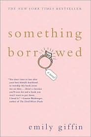
Everyone has seen the poorly rendered 3d-style images that look like robotic mannequins. Sometimes people will combine those with photos and even clipart. The result is almost always bad. Really, really bad. It would be far better to go with a nice font and use the title to fill the cover. If you really must have some graphic detail, consider an abstract background or an object that is significant to the story. Traditional publishers have been using this style for years. Check out Something Borrowed, by Emily Giffin, which is currently on the New York Times Best Sellers List, sporting text and a small ring where the second letter “O” in borrowed would be.
Some images are just wrong. How many times have you seen a book for freelance writers with a manual typewriter on the cover? How many freelancers are still using manual typewriters? What does a manual typewriter even have to do with freelancing in today’s world? I recently saw a manual typewriter on a book about blogging. Even a modern computer keyboard probably isn’t going to be interesting or unique enough to catch someone’s eye. Again, if you don’t have the budget or creativity to get to “wow”, consider a text-only cover. It didn’t hurt sales for the bestseller, The Tipping Point, by Malcolm Gladwell.
You can also manipulate the text to create interest like the designers did for the book cover for Drive, by Daniel H. Pink and Heat, by Bill Buford.
Another big mistake is the cliché image. Using chess pieces on books about business strategies has been done to death! One book production company recently published a book that not only used the old chess cliché, it actually had the pawn featured on the book cover. Whose goal is to be a pawn? Other overused cliché’s that smaller presses can’t seem to let go of include puzzle pieces, people shaking hands and locks and keys. Unless you’ve thought of a completely fresh way to use these elements, come up with another idea.
Image desperation sometimes leads people into choosing the wrong illustration all together. The cover should demonstrate the solution, not the problem. If your book is about raising a happy child, don’t put a crying toddler on the cover. Your solution — the topic of the book, the information people want — is the happy child, not the weepy one. When’s the last time you saw an obese model on the cover of a weight loss book? Hint: never! That’s because they’re selling thin, thin is the solution. And avoid the temptation to be too clever. If your book is called A Blueprint to Happiness, do not put house blueprints on the cover.
Also stay away from anything that could be construed as offensive on a cover. One publishing company has its own promotional book cover featuring a naked statue with the male appendage almost dead-center. As if this weren’t bad enough, there is also an elbow poking onto the cover from the right, with no body.
I’m not suggesting these elements can never work, they just need to be handled carefully and with originality, otherwise your book will get lost in the crowd, look dated or worse, shout “amateur”. Amateur projects get rejected by the Barnes and Noble small press program, independent bookstore owners and even distributors and reviewers. Don’t make the mistake of thinking the public is always your first line for sales . . . they’re not. Getting past the professional eye of retailers, reviewers and distributors isn’t easy, but having a solid, professional cover design greet them increases you’re chances of getting noticed.
Get an Editorial Review | Get Amazon Sales & Reviews | Get Edited | Publish Your Book | Enter the SPR Book Awards | Other Marketing Services


Interesting article. Your view fits in with the way we put cover designs together at our small publishers Endaxi Press. Our latest book Saturdays Are Gold has a cover we are particularly pleased with and a book trailer that we think uses the cover to its best advantage. If a book has content of a very high standard then the the cover should match.
As a point of interest how many really good books have you found with really bad covers?
So the old cliche “Don’t judge a book by its cover” is wrong? Of course it is. When you shop for books at the bookstore, do you pick up the books with interesting covers or do you pick up the ones with dull, uninteresting covers? A good cover makes a good first impression.
That being said, how do you think web searching affects how covers should look? Covers might end up being the “second impression” instead of the first. Also, with ereaders rapidly becoming more prevalent, how should covers be handled there considering the wide variety of formats and capabilities?