

Why is it some book covers pop while others are astoundingly wrong? As a self-publishing author it’s essential to get it right. Here are five factors to consider when choosing a design.
 1. Does your cover represent the contents of your book?
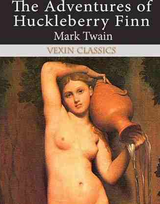
Sometimes a cover cannot be judged by the book. Take a look at this edition of Huckleberry Finn for example – does an urn-carrying nude really tell us the story of two boys on an adventure? Obviously not. You may know the image you choose is pertinent because something happens in the book, but does your title reflect that? Will your reader ever know that? Sales are dependent on the cover. Steve Kleckner, VP for merchandise at Macmillan talks about confusing covers in this article from FolioLit,
The bookstores will tell us, ‘I don’t know what it says, I don’t know what it’s about, so I don’t like it, I won’t read it. It’s gone.
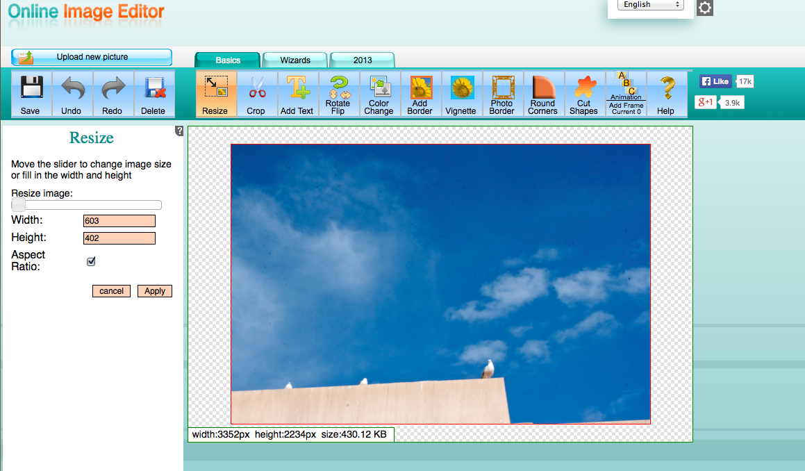
2. How does the design look thumbnail size? Try this neat trick.
When your book cover is full size it will look great. But how will it look on Amazon? A mobile phone? An iPad?
You can test this out by uploading your image to Online Image Editor and scaling the image to see how it will look , and it’s really easy to use even if you’re not very savvy with a computer. Here’s some useful info on sizing for thumbnails and the like:
- Amazon Thumbnails are 115px x 115px
- Barnes and Noble Thumbnails are 260px × 396px
- Smashwords info from Mark Coker on book size ratios at various outlets
Once your book is on sale, you can use Screenfly to check it out. Screenfly allows you to enter any website URL and see it on any screen size. Just type in the URL, for instance, your author page or website, and check it out on all devices rendered on your computer screen.
3. What are the licensing rights on your book image?
 By scrimping on your book cover you may end up duplicating, or very closely imitating, another book’s image. This could be terrible if the book you twin with is about something really different to yours. Or worse, the same… Here are some examples of that very issue.
So what alternatives do you have?
- By using an original design by a book cover artist, you can save yourself an embarrassment on Amazon. Search for “Book Cover designer” to search for reliable and professional services available.
- Have a small budget? Any good at photography? Then why not pick up your camera and go out and find an image you can take yourself? That way you own the rights to your image and it will be unique.
- Ask at your local arts college or community club if you can run a competition for “best book cover”. Then you’ll have at least 30 designs to choose from for free! The prize? Getting to be on your book.
- Maybe you have a friend or family member who can draw. Ask them to knock up some ideas. They may come up with something great! But be objective. See Lousy Book Covers, at Number 5.
- Consider using a plain cover with a great font. See J.K. Rowling’s book The Casual Vacancy, or Hugh Howey’s Wool for examples. You can get really great fonts at dafont.com, or a custom font at devicefont.com but bear in mind you may need to pay to license the usage.
4. The wrong font can be murder to a good book cover
In an article by Fast Design, a survey uncovered the most unpopular fonts in design today, though when tailored to book covers, we find our own top 5 hatred lies with these:
-
 – forever ruined by the movie Avatar and fairy/goblin books. Use at your peril for anything but.
-
 – Not a cover font – overused and abused, this needs to stay on body text for pamphlets unless you wish your cover to approach the look of a technical manual at a public office.
 – Ruined by The Da Vinci Code, every book using this looks like it’s ripping off Dan Brown, and it’s not certain any author wants to come across as a poor man’s Dan Brown.
 – Used as the iPod font, this will make your book look like a computer manual whatever it’s about.
 – Gives the look of a school fete poster or a retirement home bingo announcement. Amateur and snarky when not used in its proper form as speech bubble text in comics.
-
 – Girly, girly, girly. Would only work on a very low rent chick lit cover with a title something like ” Cupcake Cassie’s Hair Salon For Kittens.” Or maybe, “Kittenz”.
5. Is your cover “professional” enough?
Just because you paid for it doesn’t mean you got a professional job – we know some really prolific designers who are pure trash (unfortunately we can’t tell you who, but take a look at Lousy Book Covers for starts. They give good advice:
Browse through Amazon and find at least twenty books with good covers that you would expect to appeal to the same readers as your book. They can be self-published, small press, or Big Six; what matters is that these are the books that your book is going to be both palling around with and competing with.
What is a “good” cover? It’s one that appeals to the reader who would likely enjoy the book. You wrote your book, so you probably like books in that same subgenre, so use your own taste to decide whether the book covers you explore are good or not.
If your publishing package provider is forcing you to use their cover service, don’t agree on the first design. Ask friends and family, or blog about it on Facebook or Goodreads and ask for feedback. At SPR, we have discovered certain companies that force clients to accept the first cover provided, so if you are not sure, ask lots of people’s opinion before accepting it. Remember, you are the client, and you have a right to whatever book cover design you want. Don’t be talked into a bad design. It could cost you your book.
Finally, have some fun with this great post from Buzzfeed if you want some more Schadenfreude. But beware: pride comes before a fall. What’s your book cover looking like?
Get an Editorial Review | Get Amazon Sales & Reviews | Get Edited | Publish Your Book | Enter the SPR Book Awards | Other Marketing Services


Leave A Comment