

Many authors have bemoaned their CreateSpace paperback quality, i.e. print cover results in forums. But there are certain tricks of the trade that are right in front of your nose that would have given you a perfect result. Here’s a quick rundown of some easy to grasp techniques when choosing your print options with CreateSpace.
Do your interior first
Remember that you need your page count before you do your cover, because you need to know how wide your spine is! When you download your template, you will need to input the exact number of pages. Remember the interior is not US Paper Size/A4 but the size of the book, so you must complete the interior at the correct size before commencing the template download. You can download:
Interior Templates
Artwork Templates
Remember the norm is between 9-11pt font for an interior. Anything bigger will look like a large font book for the sight-challenged.
Choose The Right Interior Paper Color
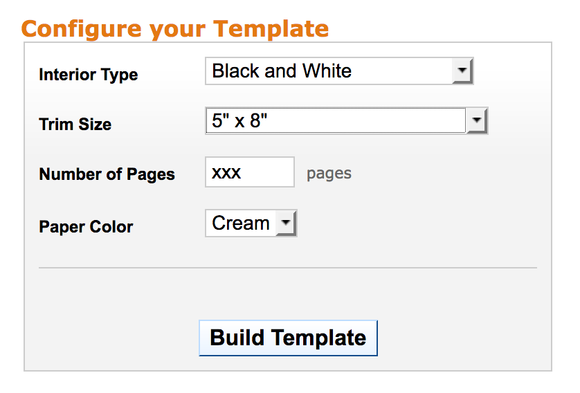
CreateSpace gives you two paper choices: white and cream. Go back to your bookshelf. Turn some books around. You’ll find most books go for cream. Standard is cream for any book that isn’t a text book. Text books are white paper, as are books that use illustrations, such as kids’ books or illustrated poetry books. Using what readers are used to will help your book feel right to them, and up their enjoyment.
You’ll want to choose “without bleed” if your book is a normal fiction/non-fiction book without photos.
Get The Right Size
CreateSpace offers lots of different sizes, but which one is for you?
If you are publishing a fiction book, then 5 x 8 or 5.5. x 8.5 is the standard size. If you want to get your book into bookstores, you need to keep it a reasonable size for stock, and bear in mind you will need to have books ready in hand and not POD if you want to get them into book stores, for instance, Waterstones in the UK will expect you to submit pre-printed copies via a distribution company such as Gardners, so storage and postage costs are a concern if you are going to submit to bookstores. Gone are the days of asking the assistant to slip a few of your books on the shelf.
Because CreateSpace charges you royalties per page, you will save money printing in a bigger size because you will cut your page count. But bear in mind your book will look somewhat cumbersome if you go higher than the 6 x 9 size.
Follow this handy article by author Therese Arkenberg over at Pulse and you’ll learn just how to do all of this sizing business. I’m not going to reinvent the blogging wheel when this article is the best.
Go Matte Cover
So many authors choose “glossy” for their paper choice when picking a cover finish because “glossy = classy” in people’s minds, maybe. OK, now do this. I assume, as you are a writer, and writers read, you have at least one shelf of paperbacks in your house. Not hardbacks. They don’t count. Just get a bunch of paperbacks lined up. HOW MANY ARE GLOSS FINISH?
I would bet you 0-2 out of every 40 or 50. Here’s one shelf of mine – the result was 4 glossy paperbacks in 48 books.
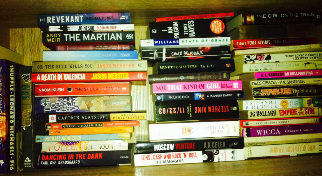
How many gloss finish paperbacks are on your shelf? (Cate’s bookshelf. Well, one of many.)
On my shelf, there are 2 large UK style paperbacks, known as a “Trade Paperback.” One is a tester for glossy/matte Moscow Venture (the author then chose matte). There is a UK mass paperback (Philip K Dick, Divine Invasion) that I think I bought at an airport waiting to fly home to Ibiza, so a European run. There is a huge European version of Stephen King’s 11/22/63, but a lot of Stephen King books are glossy. Well, he’s Stephen King. He can do as he pleases. But there’s a very good reason that choosing gloss finish is a bad idea for CreateSpace, or POD publishing in general.
Because CreateSpace is a mass “trade” POD churner it can’t calibrate so finely per book on demand, i.e. when a copy is sold, one book after the next requiring new settings. Of course, Stephen King and Philip K Dick books are not using “trade” printing, i.e. churn-it-out presses, so the fact their books are glossy is a moot point here.
Ink Issues
Printing ink just doesn’t absorb easily, or evenly, in glossy finished paper. It’s akin to pouring milk on plastic. This is why some CreateSpace authors find they have some books lighter than others, and dark colors often get muddy, or come out too light. Ink can separate or change color on glossy paper. It’s just not such a great friend of deep color unless you can have your book being printed by a more high quality, less busy press that’s calibrated for thousands of prints at a time, i.e. non-POD.
Matte, on the other hand, will soak up ink just fine. It’s like pouring – well, ink on paper. It’s much easier to calibrate how much ink is going into the paper, and the only problem you might find is that matte comes up too dark. In which case you can get your designer to tweak your design up a notch on brightness in Photoshop and your covers should come out just fine.
Edges are Everywhere
When dealing with the book cover, you’re dealing with the edges of every single margin that CreateSpace sets out in the cover template:
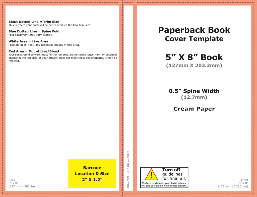
A little known fact is that if you sit text on ANY of those lines, even a bit, your cover will be rejected. So every text has to be away from those lines by a visual margin (You may have to extend your original image past the borders if you had text very close up on an edge):
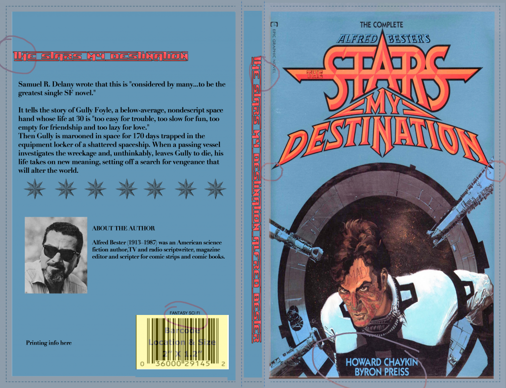
Wrong Text to Margins CS (book mockup uses this book)
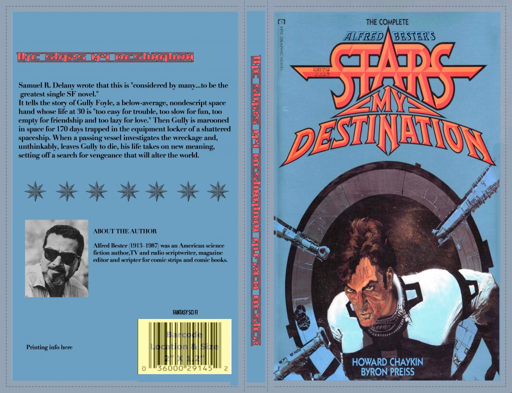
Correct Text To Margins CS
Colors Matter
When you choose colors for your cover, it’s worth considering some issues.
No-nos
- White covers will not show up well in thumbnail and will blend into the background.
- Black covers may print badly, and may look like a splodge from a distance.
- Don;t use neons or metallics – they will come out dull. If you want these, you will have to go to offset printing for “spot colors.”
Complementary Colors
Fonts and image should use complementary colors to stand out. Here’s the color wheel from Cornell University to demonstrate which colors are “opposites,” i.e. that complement each other:
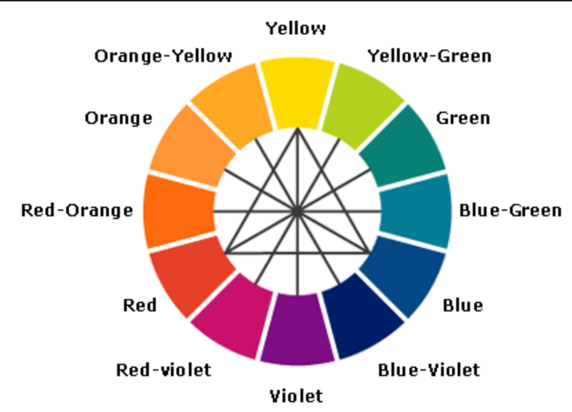
Color wheel
So if you use the color wheel suggestions, you will see it complements better:

Complementary colors shown for book titles

Genre concerns with color
A book cover needs to “fit in” with the other books it is selling against. This is mainly because readers will buy books that seem “recognizable” to them.
Here are some examples of how books “blend in” with each other in categories on Amazon.com:
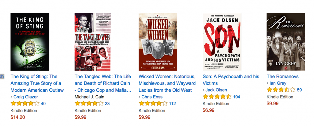
Historical Murder
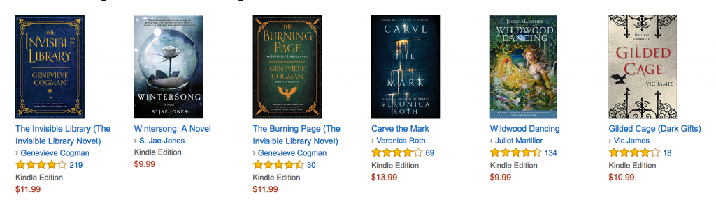
YA Magical Realism
Thrillers
Fonts Matter
When was the last time you added new fonts to your computer? Last time a book designer did it was probably today.
There are so many fonts available for commercial use for free, and also for a small amount of money on services such as www.dafont.com and www.graphicriver.net that it seems amazing that authors still insist on using standard fonts and expect a good result.
When choosing a font, make sure it’s going to be readable in thumbnail. You can see from successful books that you can read the cover’s title even at this size.
Images Matter
At this point, I feel like I’ve said it until I am blue in the face: DO NOT USE YOUR OWN IMAGERY! Did you get that? Really, don’t. There are plenty of places to buy the exact image you require.
http://www.bigstock.com and http://www.photodune.net are two industry favorites, and you may also find www.freepik.com helpful for free, but limited, selections.
Here are some quick tips:
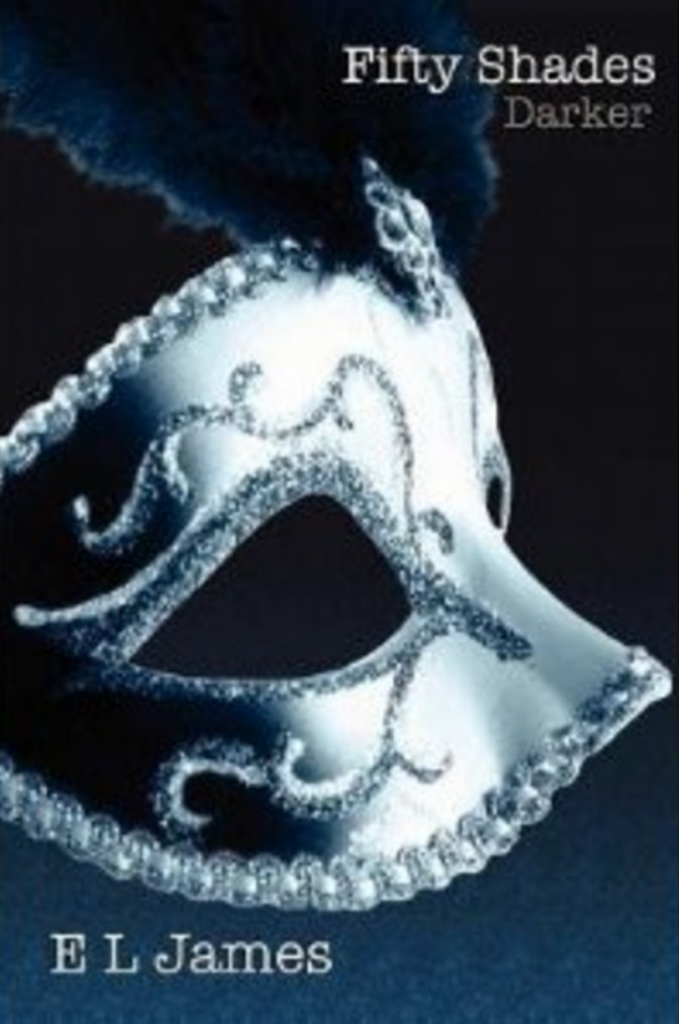
- Don’t try to represent your characters on a book cover. You’ll see across all genres this is not a recipe for success. Just take a look at the BestSeller Lists, except for romance – but even then, heads are cut off leaving chests and heaving breasts only – even “50 Shades” books use very simple icons instead of people.
- Don’t try to cram your whole book’s story into the cover. One representative image will do.
- Font is everything. Think about font first to get the feel of your cover, and then think about the image.
- Don’t expect to find the exact image you dream of, because these photos are general, not what is in your head.
Creating Your Cover PDF to CreateSpace
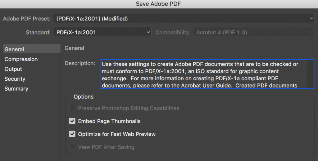
When you have your image created using CreateSpace Submission Guidelines – download here, make sure your cover file is saved as a PDF with embedded fonts (see how to do that here) and at 300dpi, which is the quality required for printing with ink. Here are the settings I recommend you use so that your colors stay more or less the same and there are no problems with any translations to print (these shots are from Adobe Photoshop, but you can use these settings for Adobe Acrobat and InDesign too):
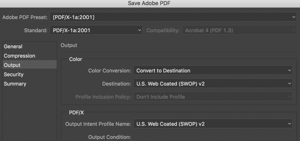
Settings for PDF for cover submission to CreateSpace
Order A Proof
Amazing to me again that an author would rather just check the digital proof on CreateSpace and not actually hold the book in their hand just to save $3 or $4 and a little bit of time. You will find ordering the print proof to your house so you can check it has many benefits. In fact, I recommend you buy three, and compare them for quality, cut, and how the pages have squared off. Any issues you can contact CreateSpace and discuss them before ordering more.
CreateSpace – worth it?
It’s worth remembering that CreateSpace really does offer you the best deal in terms of POD distribution, working with the biggest suppliers in the world. That, and the fact that people search on Amazon ten times more regularly than Google, it’s obvious that being on Amazon with your print book gives you a big advantage over other printing options, who all advertise on Amazon anyway. Also worth bearing in mind that the option in KDP does not give you the opportunity *yet* of buying discounted author copies.
In conclusion, as long as you follow the templates and basic design rules mentioned here, you should get a decent paperback book result, and get featured on Amazon really fast, which is exactly where you need to be right now to sell books.
Get an Editorial Review | Get Amazon Sales & Reviews | Get Edited | Publish Your Book | Enter the SPR Book Awards | Other Marketing Services


I’d add one more suggestion. I’ve had trouble with spine alignment being out of kilter as much a 1/4-inch L&R in the same CreateSpace shipment. You cannot do much about the spine text being out of line, but you can make the background less critical. Either have the same color wrap from front to spine to back or have a vertical bar of a single color that covers the spine extends well onto both sides of the cover.
That’d let you avoid a tiny strip of color appearing where it doesn’t belong. That looks especially bad when the spine color bleeds into the front cover.
What I do in Adobe is to have a layer underneath everything that’s one color. That way, you can’t have any gaps with the design. This kind of issue is why a proof copy is essential – maybe actually a few, as it is, as you say, variable from print to print!