

Authors understand that a book cover is far more than a protective wrapper for their manuscript. Whether you’re publishing a self-help book grounded in thoughtful research or writing a fantasy novel, your cover serves as a sophisticated visual handshake. Most importantly, it’s often the difference between a reader’s fleeting curiosity and a confirmed purchase.
While authors and publishers put a lot of thought into the aesthetics of a book cover, the most effective products tap into the subconscious triggers of the human brain. People make quick judgments about quality at a glance, long before they search for online reviews. If the visual packaging fails to communicate the right emotions and ideas, a potential reader has likely already scrolled past. The stakes for this first impression are incredibly high — especially in the hypercompetitive world of publishing.
The Emotional Language of Color and Type
Color is the first thing the brain perceives and interprets when you spot a book cover. Before your eyes even get the chance to glide over the title, your mind has already assigned a mood to the work based on the palette. Studies highlight that 62% to 90% of decisions revolve around color, making it no surprise that it plays a huge role in genre expectations. High-contrast black and red shades often depict a sense of danger, making them a great choice for thriller novels, while a romance book would likely benefit from softer pastels.
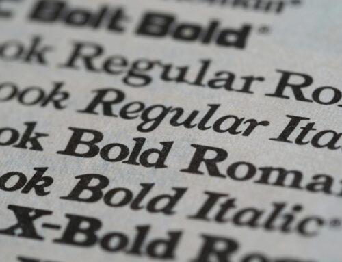
The typography of a book cover is also a highly important consideration, as it functions as an “internal voice” for people reading it. For example, serif fonts give off a traditional and grounded vibe, appropriate for a historical fiction piece. Alternatively, sans-serif fonts signal fast pace and innovation. Considering that 81% of customers try something new when the packaging catches their attention, building a strong understanding of how these elements work is essential for any author to encourage new readers to take a chance on their work.
The Importance of Visual Weight
Even when color and font have been effectively chosen, compositional psychology is an aspect of book cover design that cannot be overlooked. Brains choose which piece of imagery or bit of information to prioritize based on the visual weight of all the individual elements. If you make your title and image too similar in size, it creates a sense of homogeneity that could confuse the eye.
A great book cover guides the reader’s eye through an intentionally mapped visual journey, thoughtfully selecting which features to emphasize based on what it aims to conjure in the potential customer. When someone can instantly categorize the book, it creates a sense of subconscious comfort and familiarity.
Effective Marketing Makes a Difference
As the landscape of authorship becomes increasingly competitive and saturated, especially with the rise of generative AI, writing a great book is only half the battle. Understanding the entire publishing process from start to finish is imperative for success in the industry. A great cover can shape consumers’ first impressions of a book and their decision to buy it. Therefore, writers should emphasize creating one that looks good and also represents their story the way it deserves.
![]()
![]()
![]()
Get an Editorial Review | Get Amazon Sales & Reviews | Get Edited | Get Beta Readers | Enter the SPR Book Awards | Other Marketing Services


Leave A Comment