

 For independently published authors, writing a well-received book is about more than the story. As an indie author, you’re responsible for everything from commissioning a cover to formatting your book. The font you choose for the text inside and out has to be readable and fit within the margins and gutter. Professional-looking typesetting can make your book stand out and enhance the story.
When you’re just getting started, figuring out what font to use, its size, and how it translates for digital books and hard copies can seem overwhelming. Fortunately, knowing a few basics can drive your success.
How to Typeset for Beginners
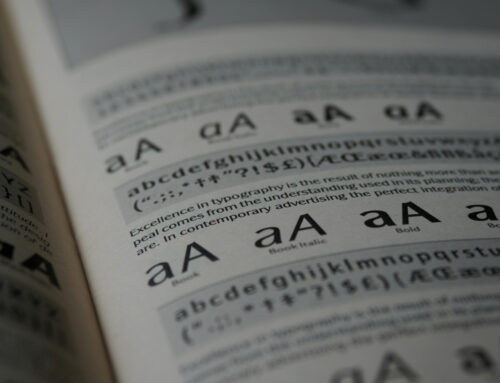
What exactly is typesetting? The main element of typesetting is arranging words on a page to be attractive and readable. It involves choosing a typeface, font size, and spacing of the words and paragraphs. Typography is the style and appearance of printed materials. It is a typesetting component but adds layout and structure to the task. Typography adds stylistic elements such as drop caps.
Experts predict the font and typeface market will reach $1.532 billion by 2032. Growing demand from self-published authors for readable fonts continues.
Some might argue it is an artistic craft to make the reading experience more engaging for the user. However, excellent typesetting becomes almost invisible, putting the focus on the story or lesson the book offers. Here are some things to consider as you choose typesetting for your book:
1. Choose Serif or Sans Serif
Traditionally, publications used a serif font, such as Times New Roman for printed materials. The serifs on the ends of letters made the text legible and helped readers decipher the difference between characters like the number one and a lowercase “L.”
Today, the choice between the two boils down to the medium you’re using and the tone you want to set for your readers. For a conservative or serious tone, select a serif font for a more traditional look. On the other hand, you can go with sans serif for a more modern appeal. Traditionally, publishers used serif fonts for print and sans serif for digital publications. However, indie authors can break any rule of thumb if they have a purpose.
2. Select Accessibility Over Style
Typesetting should focus on keeping text readable above style or other considerations. Consider your audience. For example, considering most countries today are experiencing rapidly aging demographics, many of your readers are statistically likely to be older. For these older readers, you’ll want to ensure the font is accessible for those with failing vision or who need readers to see up close.
Consider your readership. What countries buy your books? How many of your readers are over 65? Knowing your audience can help you choose the appropriate typeface.
3. Stick With Standard Font Sizes
Unless you are specifically creating a large print edition of your book, it’s wisest to stick with the font sizes readers are used to and remain consistent throughout your book. Most print books are between 10-point and 12-point font size. Kindle Direct Publishing insists on at least 7-point fonts to keep the text legible. Play around with the font you’ve chosen to see what looks best.
A font with a taller appearance may look better at 10 or 11 points, while a squatty typeface may need 12 points to remain readable. For digital copies of your book, you have more flexibility. Most ebook readers allow the user to select the font size and make adjustments for better readability.
4. Tweak With Kerning and Line Spacing
The white space between letters, lines, and paragraphs can help break up text and make the body of your work more readable. Kerning can push letters together or farther apart, depending on your goals. Don’t be afraid to tighten spacing to keep an ending sentence on the same page instead of floating on a separate page. Be consistent with the elements you apply, so the book looks the same throughout.
You can also narrow the gap between lines of text for a sharper appearance. Add extra space between paragraphs, especially for digital copies of your book.
Review the Proof
Once you have your book typeset the way you’d like, print it out and make sure the typesetting appears the way you’d like. For ebooks, produce electronic copies and read them on the device your customers will use. Typesetting requires tweaking and changing until you hit on the perfect combination of fonts, sizes, and spacing to draw the reader in and keep them turning pages.
Mastery of typesetting adds a final polish to your self-published books. Professional quality materials encourage readers to work through your backlist and share with others what they love about your writing.
![]()
![]()
![]()
Get an Editorial Review | Get Amazon Sales & Reviews | Get Edited | Get Beta Readers | Enter the SPR Book Awards | Other Marketing Services


Leave A Comment