
In Part 1 I started with a book in the standard format we all send to agents and formatted it in preparation for print. This article continues with formatting the manuscript for a particular book size.
Choosing a book size
Since I’m self-publishing, it isn’t likely my paperback will be stocked in Barnes and Noble. Potential buyers will probably see an image of the front cover online. When they receive my book, I want them to be pleasantly surprised by the quality.
Most of the books I examined that were similar to mine were 5.25″ x 8″. I also found a few that were 6″ x 9″. My printer charges the same per page for both sizes. Should be a no-brainer, then. But typographers will tell you that the optimal number of characters per line is 66. So, with a larger format, you’re going to end up with a larger font and/or wider margins to get the same number of characters across the page.
Setting the font size and the margins
You can either set the paper size and margins to actual or you can leave the paper size at ‘letter’ and compensate by using larger margins. Find out what your printer wants before you set them.
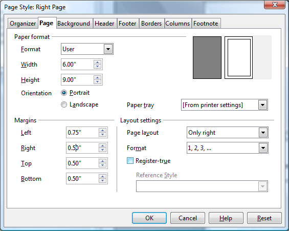
Since I was using several different page styles, I needed to set my paper size in each of them. I started with the Default page style.

In Part 1, I had set the Page layout to Mirrored. I set the Paper format to User, six inches wide, and nine inches high. I set the margins to what I was told by my printer were his suggested minimums. Note that the margins in the non-mirrored page styles are worded differently.
Font and font size
Fonts vary a bit in character widths, so I didn’t want to try to set font size and my final margin sizes before selecting a font. After considering several, I settled on the old reliable Garamond. The font had to be changed in all of the paragraph styles and in the Drop Caps character style. I looked at some 6″x9″ paperback books and settled on an 11 point font size for the body text.
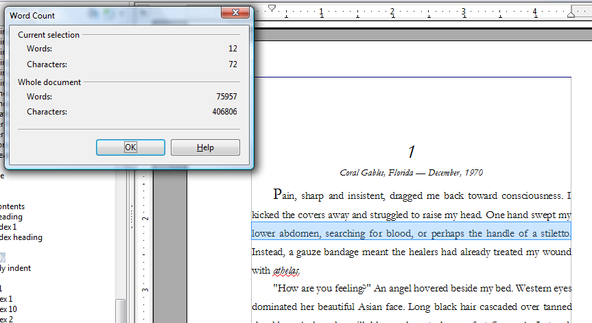
OpenOffice has a word count tool in the menu at Tools and Word Count. I selected a typical line.

Some typographers will tell you that a line should have between 45 and 75 characters. The ideal of 66 includes spaces. My lines were a little too long. That meant using a larger font size or increasing the margin(s). I chose to increase the margins a little. Changing the inside margin to .9″ and the outside to .6″ reduced the number of characters in a line to a more acceptable number and allowed for the wider margins I had wanted.
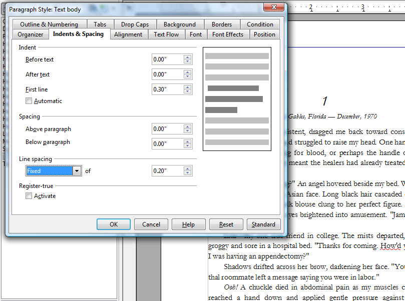
Line spacing
Along with font size, the amount of white space and its distribution affects reading enjoyment. I tried quite a few different combinations and the one thing that seemed to most affect the price of the printed book was the line spacing. Clearly double spacing was more than necessary, but how much was enough?
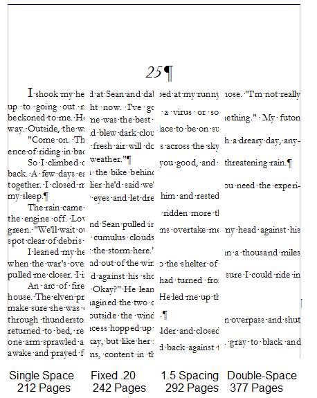
For each size, I printed out a chapter and read it. As a sanity check, I compared my line spacing to books similar to mine. After playing with several fixed line spacings, I settled on .20″. Line spacing is set in the paragraph styles.
Chapter Titles and Drop Caps
Adjusting the size and positioning of the chapter titles and the size of the first letter in the chapter seemed arbitrary. I changed sizes and positions until I came up with something I liked on the printed page. At this point I expected to get close to a first cut at my design.
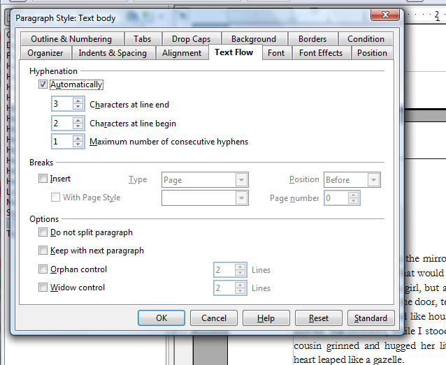
Hyphenation
Several sources I consulted indicated that the flow of white space on a page was a good indication of how professional a book design was. I suppose you could do all of your spacing by hand, but turning on hyphenation seemed like a reasonable place to start. Since hyphenation is under the Text Flow tab in the paragraph styles, it has to be enabled for each style where hyphenation is important.
Cleanup
That’s it for the prep work. The rest is cleaning up. White space and orphans. Before doing that, however, make sure you’re happy with your interior design. If you change font, font size, line spacing, etc, you’ll need to do your cleanup again.
White Space
Even with hyphenation, you can still have some lines or areas that stand out because the words are spread out more than the surrounding lines. One advantage of being the author, is you can sometimes find an alternate way to say something that looks better on the printed page.
Orphans
You don’t want chapters to end with a single line on a new page. Same with scenes. Scenes breaks shouldn’t be on the last line of a page or on the first. My own rule was that a scene break not appear on the last two or first two lines of a page.
There are a number of ways to shift text up or down the page. My rule was to always eliminate enough text to shift the scene break or chapter end up. I would start with paragraphs which ended with a single word on their last line, to see if I could cut a word. Sometimes I eliminated entire sentences or paragraphs. I agree that by this point in the process there shouldn’t be any fat to cut, but who of us can’t afford to tighten up our prose?
Proofing
In our exercise room is a ton of paper, stacks of marked up drafts and revisions of my novel. I try to do most of my editing and proofreading online, but there are things I notice on hard-copy that I miss on the screen. When I thought I was finished with my formatting and design, I printed out the entire manuscript again. I made sure to turn on the print driver feature that drew page borders. I printed the pages in duplex mode, even stapled them.
The final step is to output the file as PDF and have my printer send me a single copy of the book. I expect to find more things to change then.
Get an Editorial Review | Get Amazon Sales & Reviews | Get Edited | Get Beta Readers | Enter the SPR Book Awards | Other Marketing Services


Very informative blog. I would encourage you to get a couple more quotes for your self-published book. You made a comment that your printer charges you the same price per page for your book is 6″x9″ vs 5 3/8″x 8 3/8″. My printer charges considerably less for the smaller format. Reason being, they can fit 4 copies per page on the smaller format vs only 2 per page on the slightly larger one. In other words, they can produce twice as many copies of your book on the same amount of paper. My printer than passes that savings on to the customer. You can either contact the printer through their website I provided or e-mail the sales person I deal with at californiakaylee@yahoo.com.
Good luck on your book!
Thank you, Robert. When self-publishing, it’s always good to keep your goal in mind. Mine is to get a quality paperback into the hands of my reader at a reasonable price.
Consider this scenario–Someone walks into a local Mom and Pop bookstore and wants to order my book. The store orders from its normal distributor. They order from my printer/pod.
I set the retail price. I set the discount, which determines how much my printer/pod charges for the book. The question then is how much of the proceeds will my printer/pod keep?
I provide ISBN, CMYK-TIFF cover artwork, and a PDF of my manuscript, formatted for the book size. Let’s say that’s the smaller size, as you suggest, a 5.25″ x 8″, a standard size. The book has 266 pages. Creme colored paper, 55lb.
My printer/pod charges a one-time setup of $75 and a $12 annual catalog fee. These are per title.
For a single book, with a retail of $14 and a 50% wholesale discount, my printer/pod would charge the distributor $7. Out of that $7, my printer/pod is going to pay me $2.64. They charge $4.36 per book for everything they do, including printing.
So, the single unit cost to me is $4.36. Delivered to my reader.